Orders needed clearer priority
Kitchen and bar staff needed to quickly see which tickets had been waiting the longest.
UX/UI Case Study
A role-based restaurant ordering interface that helps kitchen and bar staff track orders, manage preparation status, and coordinate linked drinks with less confusion.
Restaurant Chapeau is a small fine dining restaurant in Zeewolde with 10 tables, a mostly student staff, and no digital ordering system. Orders were managed with paper tickets and verbal coordination between waiters, kitchen, and bar. The project asked us to design a role-based digital system to replace that. My part focused on Scenario 3: helping kitchen and bar staff see which orders needed preparing, track preparation status, and coordinate linked drinks without things slipping through the cracks.
Kitchen and bar staff needed to quickly see which tickets had been waiting the longest.
Starters, mains, entremets, and desserts had to be prepared and served in the correct sequence.
The kitchen needed food and course details, while the bar needed drink tickets and linked drink information.
Insight 1
Design impact
Before designing anything, I conducted a semi-structured interview with Odunayo Ajakaye, a freelance chef with deep IT knowledge who works at TotaalVERS, a large-scale food supplier in Rotterdam. The interview took place on Teams because meeting on-site was not possible. It was delayed by about 30 minutes because he had double-booked another interviewer, who went first. What made the interview useful was that he could speak in detail about how their system actually worked, not just in theory. Three things stood out: TotaalVERS's system was powerful but criticised internally for being unintuitive. Staff who were not comfortable with technology struggled with it. That directly influenced how much I tried to simplify Chapeau's interface.
Insight 2
Design impact
Their system required two confirmations before an order moved forward: the kitchen marks it done, then the waiter confirms pickup. This prevented double orders and lost tickets, but added about 30 seconds per handoff. I had to decide whether that tradeoff was worth it for a small restaurant running fast dinner service.
Insight 3
Design impact
Greasy hands, loud environments, split-second decisions. The interview made it clear that kitchen and bar interfaces need large buttons, high contrast, minimal clicks, and instant feedback. One of the staff members at the restaurant was colorblind, which made contrast a real constraint rather than a guideline.
Design decision 1
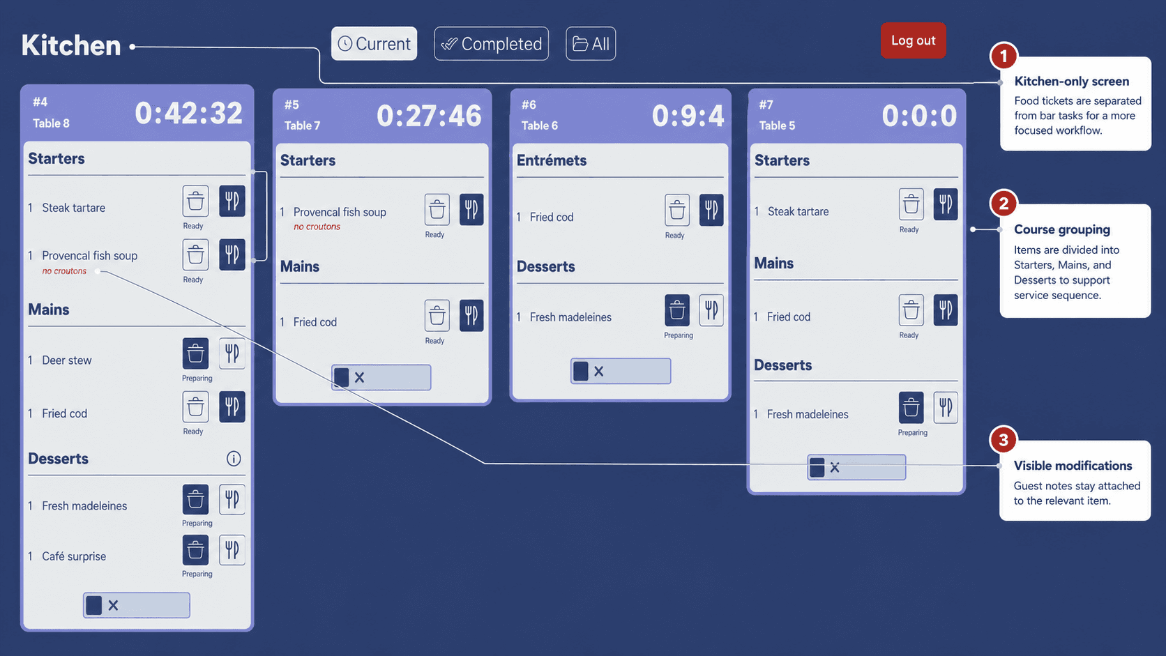
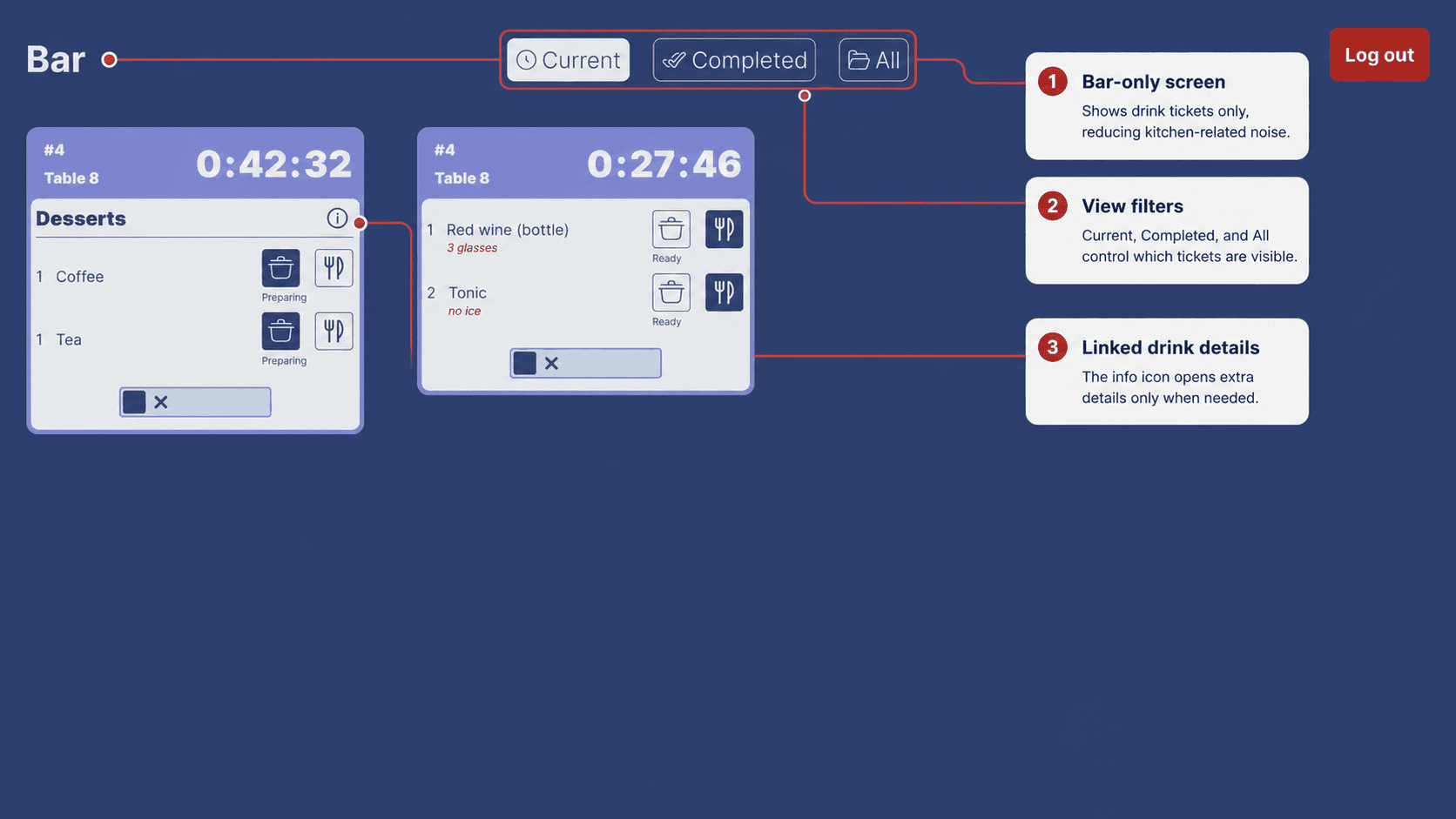
Kitchen and bar staff do not need the same information. I separated the views so each role could focus on its own tasks without extra visual noise.
Design decision 2
I used ticket-style cards because they match the way restaurant staff already think about orders. Each card groups the table, timer, items, notes, and status in one place.
Design decision 3
Items are grouped under course headings such as Starters, Mains, Entremets, and Desserts. This helps staff understand the preparation sequence more quickly.
Design decision 4
Earlier versions included more manual preparation states. I simplified the flow because kitchen and bar staff need to work quickly and should not have to update the screen too often during service. The final design focuses on clear visibility and the most important handoff moments. The dual validation approach from my research was considered but felt too slow for a 10-table restaurant where service moves quickly. The priority was keeping the interface out of staff's way.
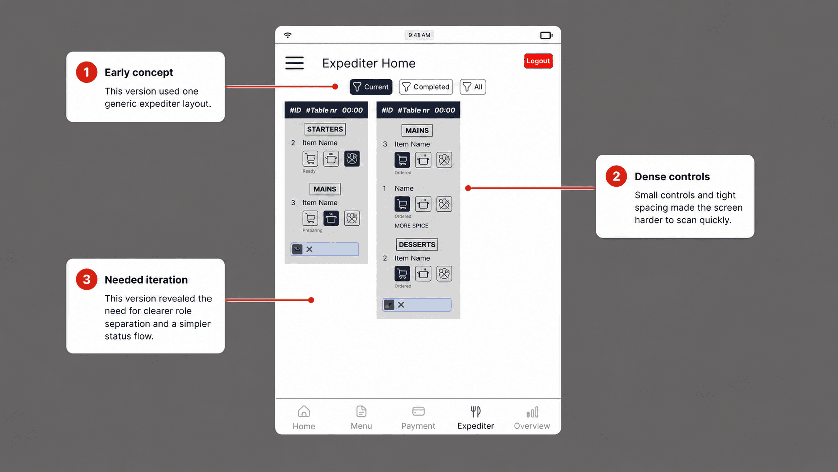
The first version explored a more generic expediter layout. It helped me test how order tickets, status controls, and filters could work, but it also showed that the interface needed clearer role separation and a simpler status flow. Feedback from this stage led to the final kitchen and bar views.
The final kitchen view focuses on food orders. Tickets are grouped by table and course, with visible notes and large timing information to support quick scanning during service.
The final bar view focuses only on drinks. This keeps the bartender's interface simpler and separates drink preparation from kitchen food preparation.
The TotaalVERS interview was more useful than I expected going in. Hearing someone describe exactly where their system failed, and why, gave me something concrete to design against. I kept coming back to one thing he said: that the system was designed for power users, not for everyone on the floor.
For Chapeau I wanted the opposite. Something a student waiter could pick up on their first shift without a tutorial. That shaped a lot of small decisions: how many status steps to include, where to put course headings, how obvious to make the linked drink indicator. None of those feel like big design moves but they added up.
If I continued, I would test the prototype with actual restaurant staff during a service and watch where they hesitate. I think the status flow works on paper but real conditions like noise, speed, and wet hands would probably reveal things I haven't caught yet.